Around 71% of the Earth's surface is covered in water. It's not something everyone thinks about when they look at their maps, but bodies of water also provide important locational context. We're in the process of reworking our cartography from the ground up. Here are some details about our recent overhaul of water name labeling.
What We Changed
The way we approached water labeling hasn't changed much since we launched around a decade ago. I had been keeping a laundry list of things to improve for a while. It started with several variations of "X should (or should not!) be visible at zoom Y," and as I dug deeper, I found a few other things we could bundle into this release.
1. Improved relevance selection in our tiles
If you can see it from space, but it's not visible till z8, that's not great! That was, unfortunately, the story of some of the world's largest lakes, including the Great Lakes and Lake Baikal.
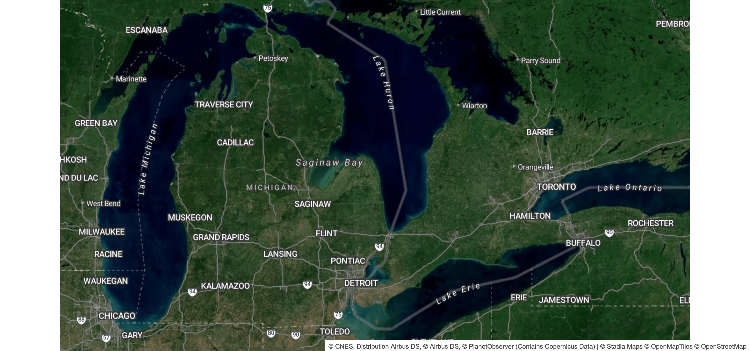
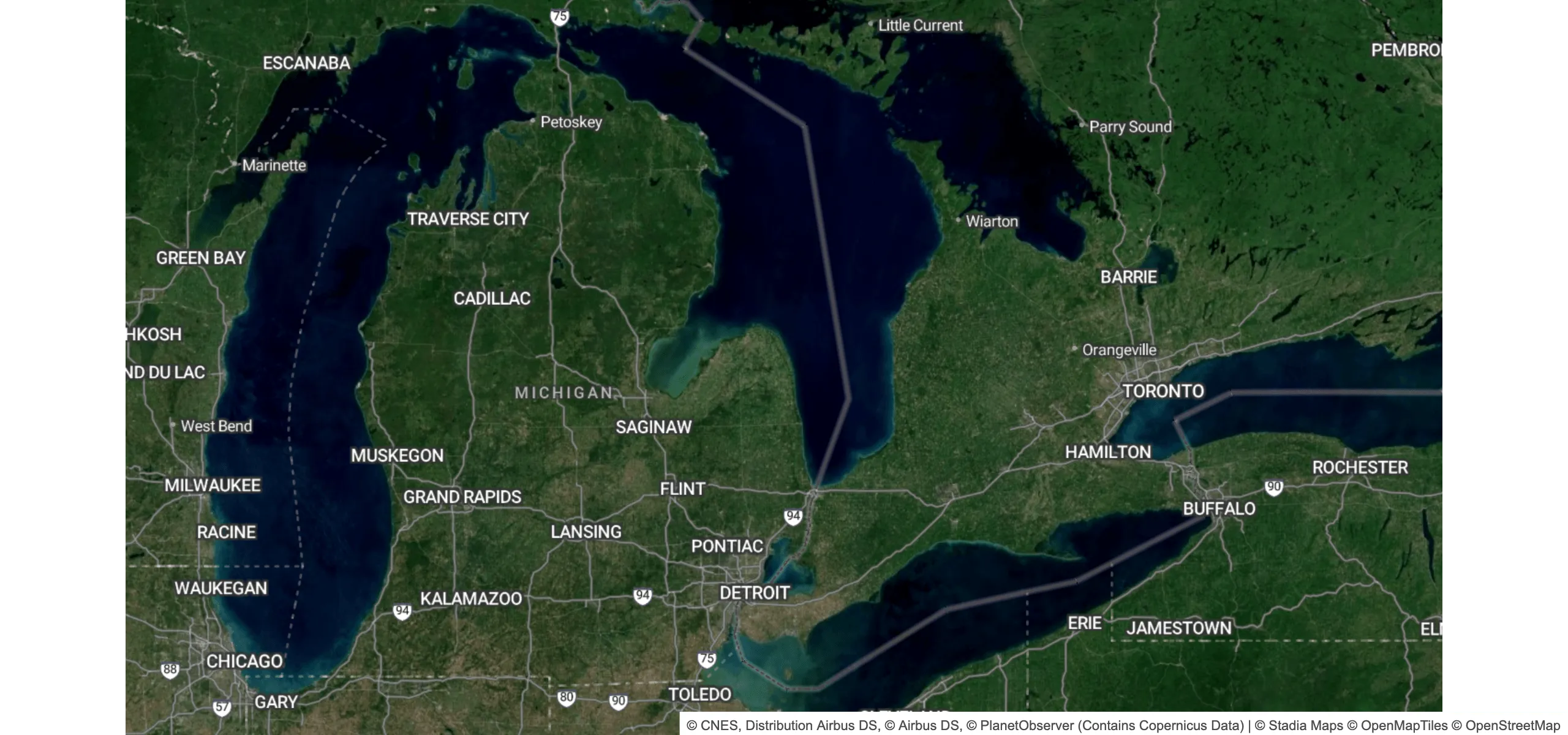
The main fix here was considering a better set of factors when determining relevance. This is baked into our tile build process, so styles don't need to make any changes.
While you may (correctly) guess that this includes more features in the low-detail tiles, we saw an unexpected improvement in tile sizes through the mid to high detail levels. We previously included many irrelevant features at mid-zoom levels. These caused frequent collisions between lower relevance labels and higher relevance ones. Removing these reduced the overall tile size and resulted in more relevant labels showing up.
2. Cleaner labels for major water bodies
We cleaned up labels for large maritime areas and inland seas.
One of our guiding cartographic principles is to display labels in the local language by default wherever possible. In most of the world, signage is only displayed in a single language/script, so our maps default to showing that. We may also display a "Latin script" name for some features to improve international readability if the place has a name in another language, like English or French.
International waters are tricky, though, since there is no "local language" and they aren't part of any one country. In OpenStreetMap, these are often given a name tag with half a dozen languages, separated by… something. This is not always consistent, makes the map harder to read, and crowds out other labels that could provide relevant context. In short, it's not great for anyone.
We've simplified our default styling to just the common English name for these features. Smaller bodies of water like lakes and smaller inland seas will continue to be labeled as-is, with both the local name and optionally a Latinized name.
This does not change anything about the data that we ship in the vector tiles. We still include dozens of languages, and if you're localizing a map for an audience with different language preferences, you can still customize the styles to fit your desired label language.
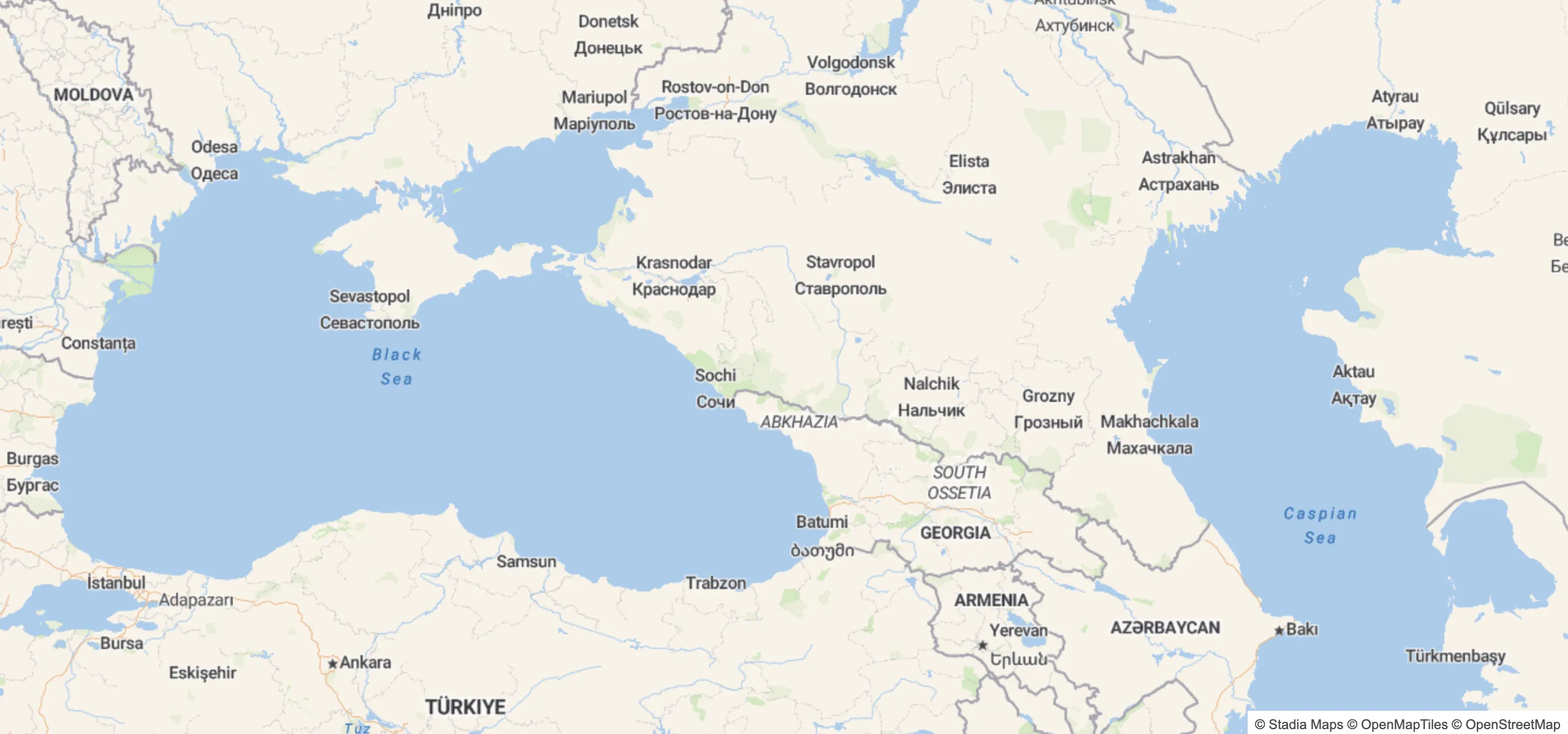
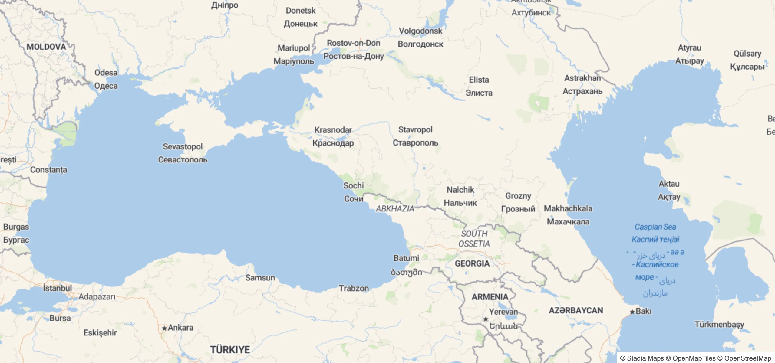
Besides being cleaner, this also lets us place more labels. Note how the Black Sea was conspicuously absent before. This was because the label would have clashed with Sevastopol, so it got dropped from the middle zoom levels.
3. Improved the placement of lake centerline labels
Our in-house map styles labeled lake centerlines inconsistently. They were often off-center at lower zoom levels, and the spacing wasn't consistent.
This is now fixed, and often results in more lake labels being placeable at medium zoom levels, since moving the label to the center steers clear of settlements bordering the lake. The main fix was changing the symbol-placement property from line to line-center in all of our styles. (The brilliant cartographers over at Stamen actually got this right on the first try, though, so their styles didn't suffer from this issue!)
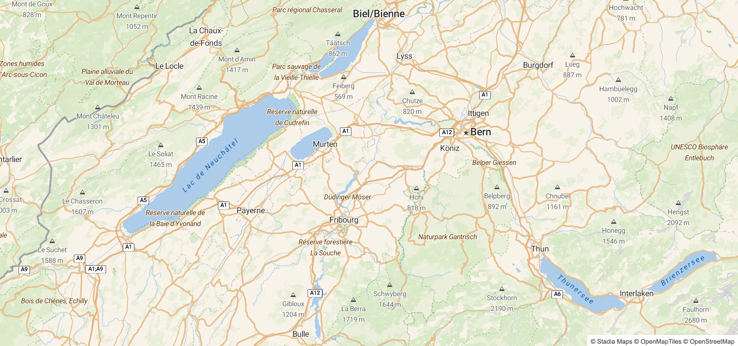
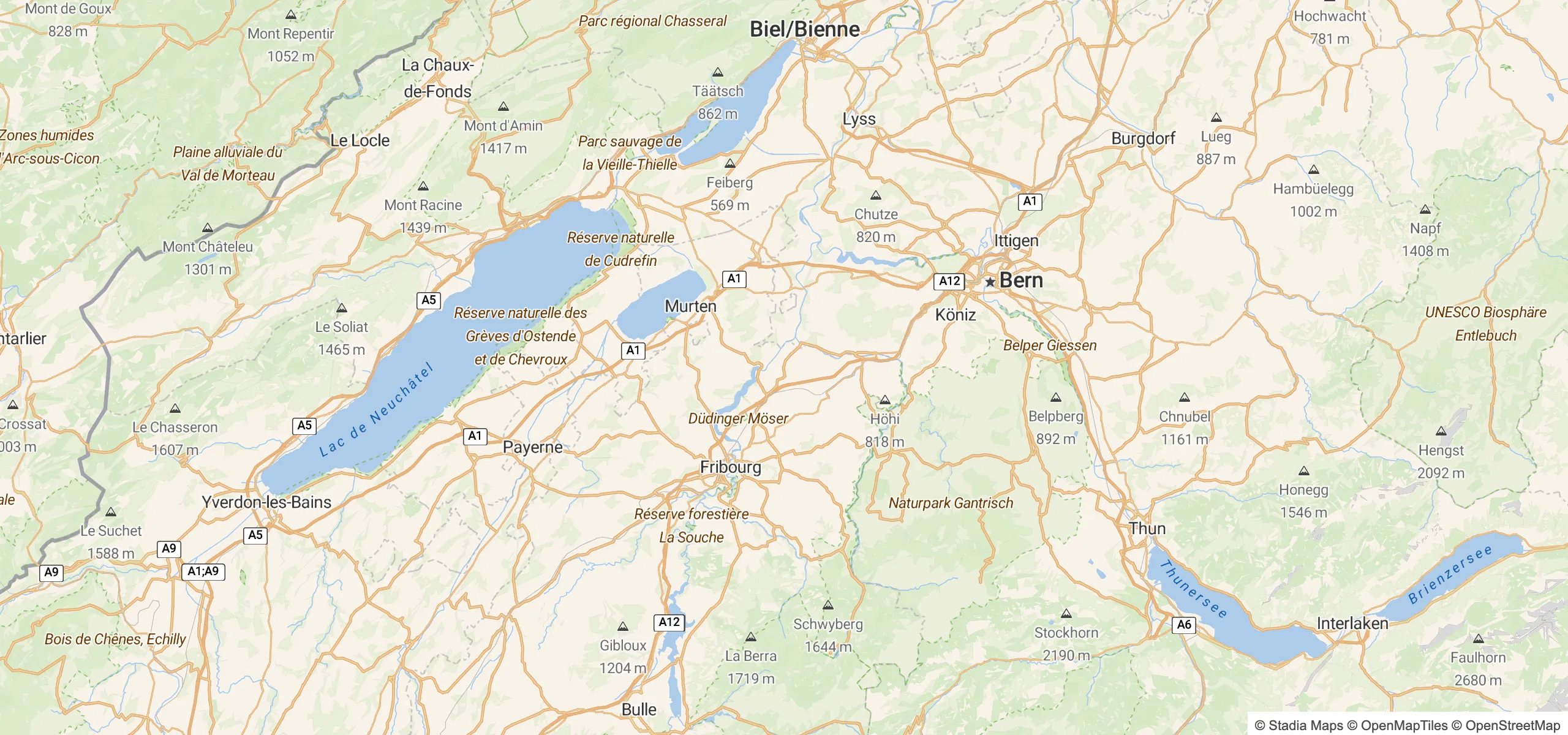
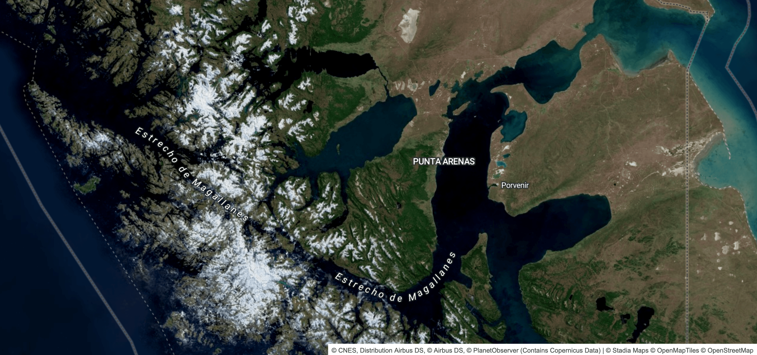
4. Straits are here!
That we never included these in our basemaps was a historical accident. Important straits will appear as LineString features in the water_name layer, so you get beautiful labels like these.
What This Means for You
Most Stadia Maps customers don't need to do anything. If you're using our raster map tiles or a vector style hosted at tiles.stadiamaps.com, you already have the latest and greatest styling. All the improvements mentioned above are already live.
If you customized your own style, you may need a few minor tweaks to polish things up. The area around the English Channel highlights the two types of features most likely to require styling adjustments.
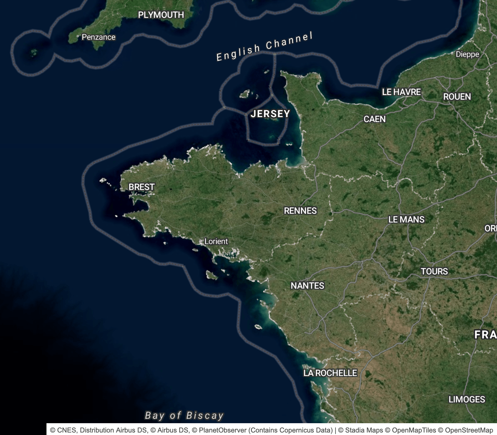
If you don't see the English Channel or the Bay of Biscay, check your style for references to the water_name layer and make sure that your class filters include strait and bay at lower zoom levels (we generally recommend removing zoom-based filters, unless you are intentionally creating a minimalist style). And if your layer for line-based water names doesn't do so already, set the symbol-placement to line-center to get the same visual improvements we showed above.