Map Style Improvements and House Number Layer
Today, we’re announcing a significant set of improvements to our map data and styles. For our Alidade family of styles, it's the most significant since we launched five years ago!
Low Zoom Improvements
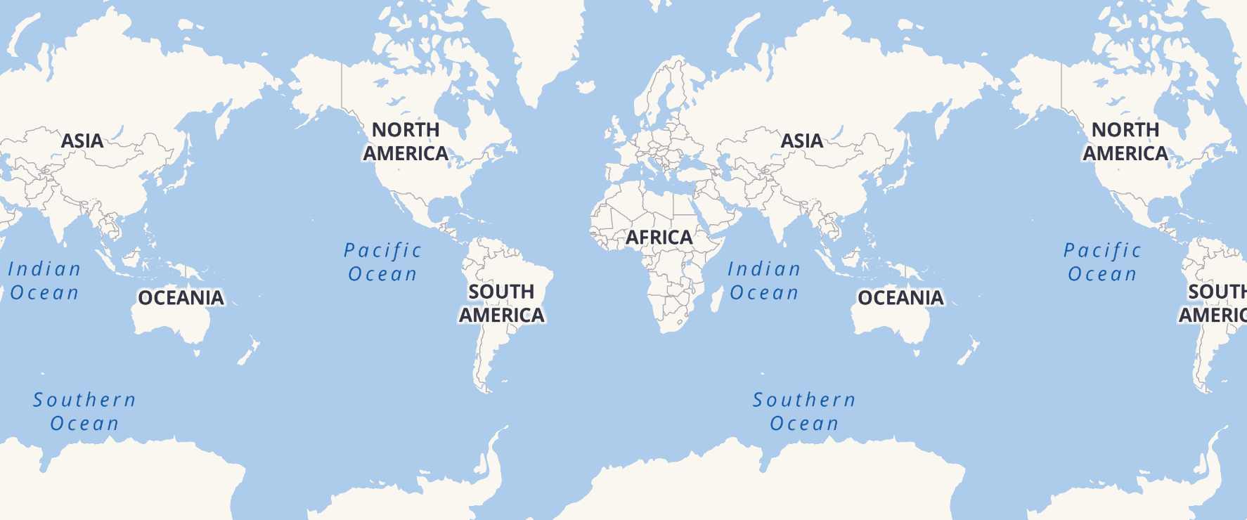
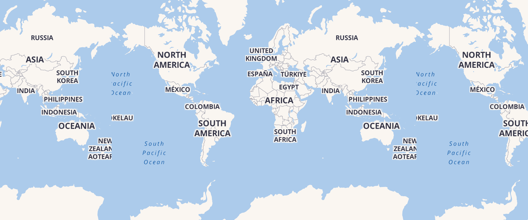
By reducing label crowding at z0, improving the display of oceans in several styles, and fixing cut labels, we have dramatically improved the quality of our lower zoom levels. These improvements and fixes are most noticeable for users of our raster map tiles and static maps.
Improved Legibility
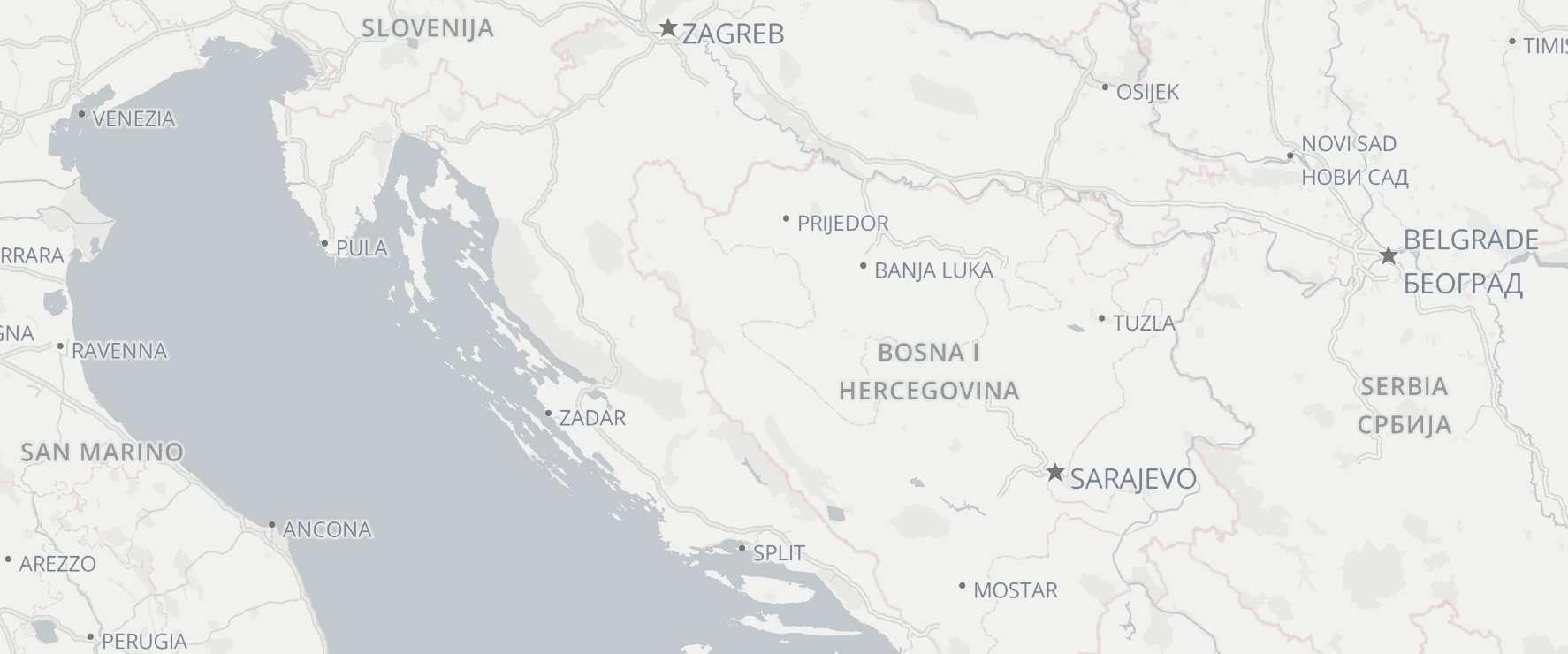
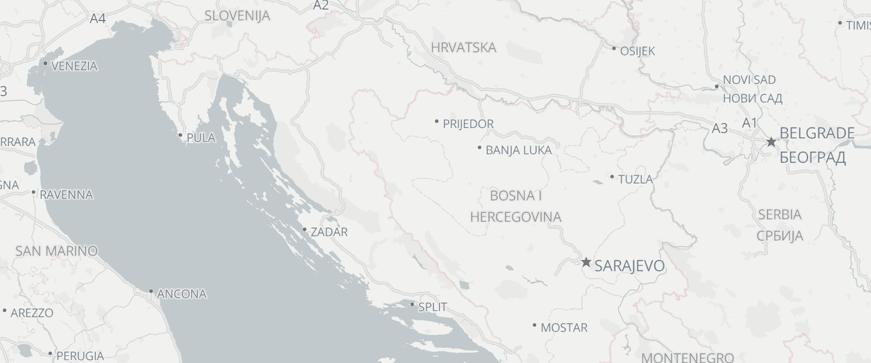
We have differentiated a number of features better in this style update to improve legibility. The most obvious change is with country names, which are now much easier to pick out due to more distinctive typography. We’ve similarly improved the legibility of water, state, and neighborhood labels in our Alidade Smooth and Outdoors styles.
Highway Shields
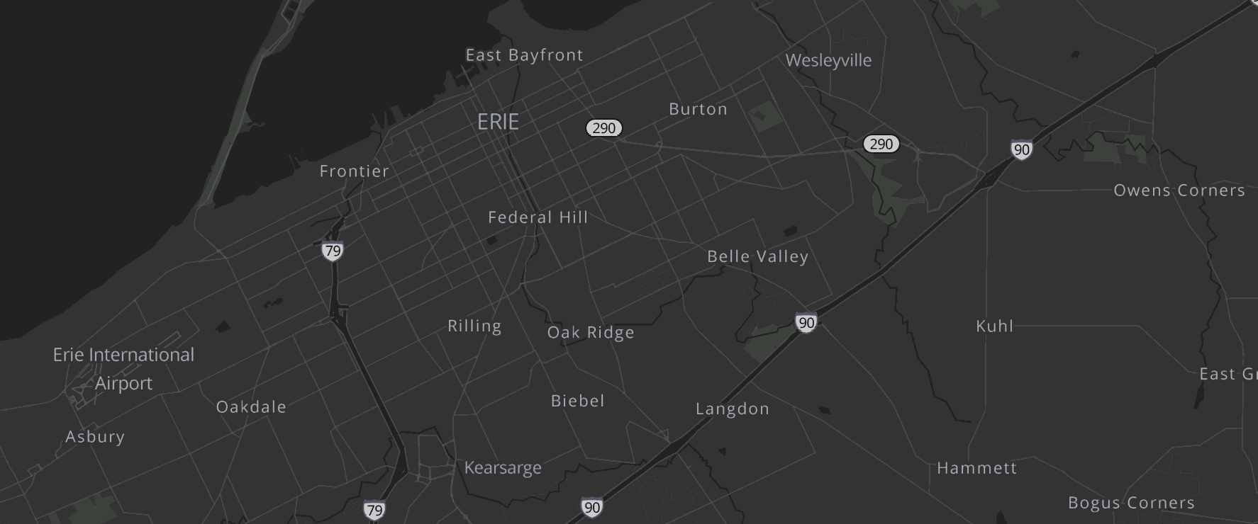
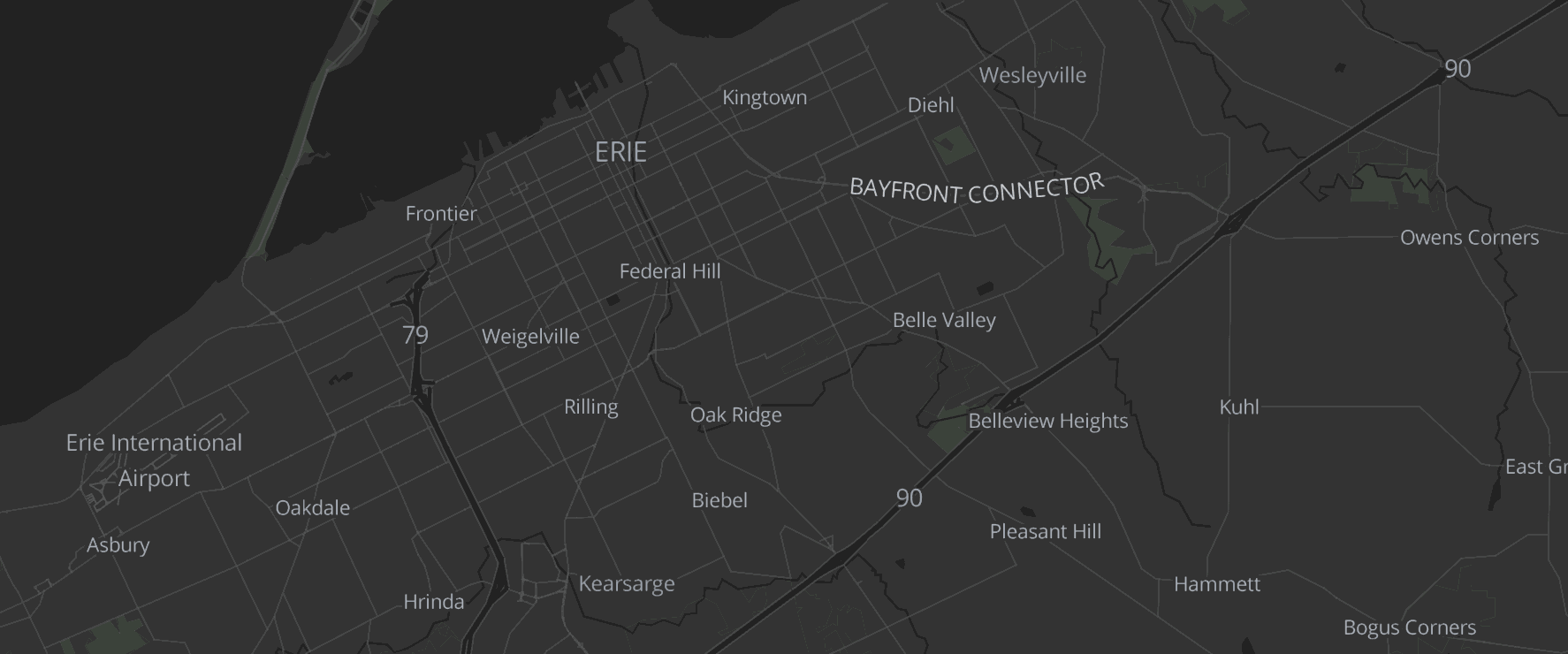
Minimalism has always been a guiding design principle for our Alidade Smooth family of styles. As a result, every addition should enhance legibility while keeping your data front and center. Highway shields pass this test with flying colors and will provide valuable context for any data set. We currently offer several styles of shields within the US based on the highway type (e.g., different shields for interstates and state route). Shields for US state routes and national highway networks outside the US are planned for future updates.
House Numbers
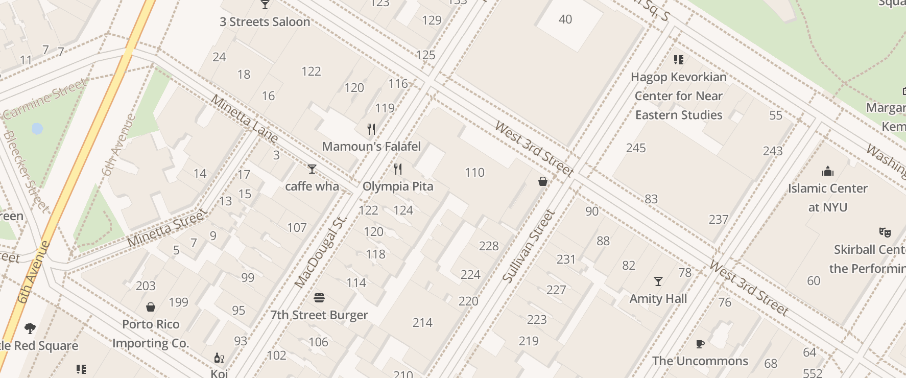
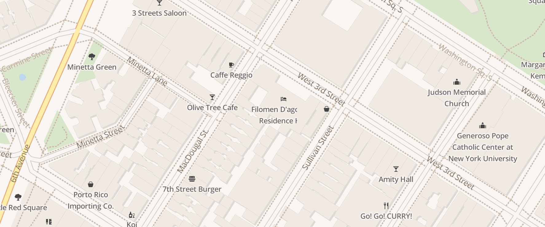
You asked; we listened! Our vector tiles at z14 now include a house number layer, and you can see it in action on our OSM Bright style. If you would like to add house numbers to another style, check out our revamped tutorial.